The Process
The High Noon logo began as a playful sketch with a cactus dripping with what looked like chocolate sauce. It started as a whimsical idea about desserts made from cactus ingredients, but through peer feedback and creative exploration, the concept evolved into something much more refined.
As the idea developed, I shifted the focus toward CBD-infused desserts, inspired by the dual meaning of “High Noon” — a nod to both the Southwestern landscape and the elevated feeling associated with cannabis.
The process involved multiple rounds of sketching, refining, and visual exploration, experimenting with how to merge natural motifs like the cactus with the indulgent textures of desserts. The result is a brand identity that feels both sun-soaked and sophisticated, capturing the calm, elevated warmth that defines High Noon Bakery.
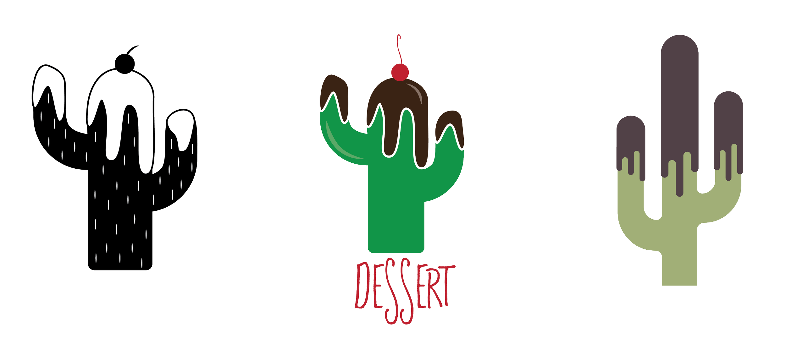
Logos
Desert heat. Ice cream sweet.

Colors
Earthy tones of the Southwest and the indulgent richness of our favorite desserts.

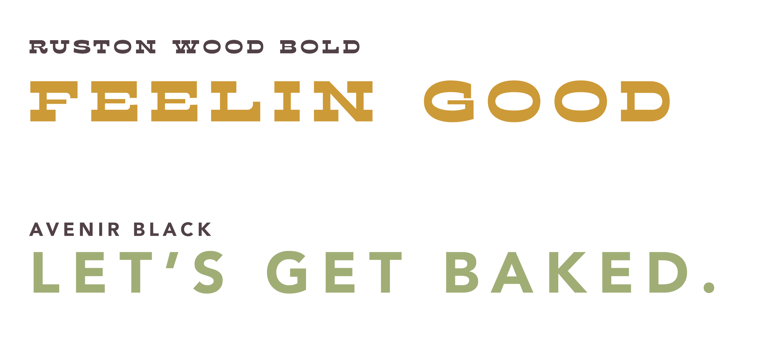
Type
The pairing creates a visual rhythm between artisan and modern, echoing the brand’s balance between handmade craftsmanship and contemporary cannabis culture.
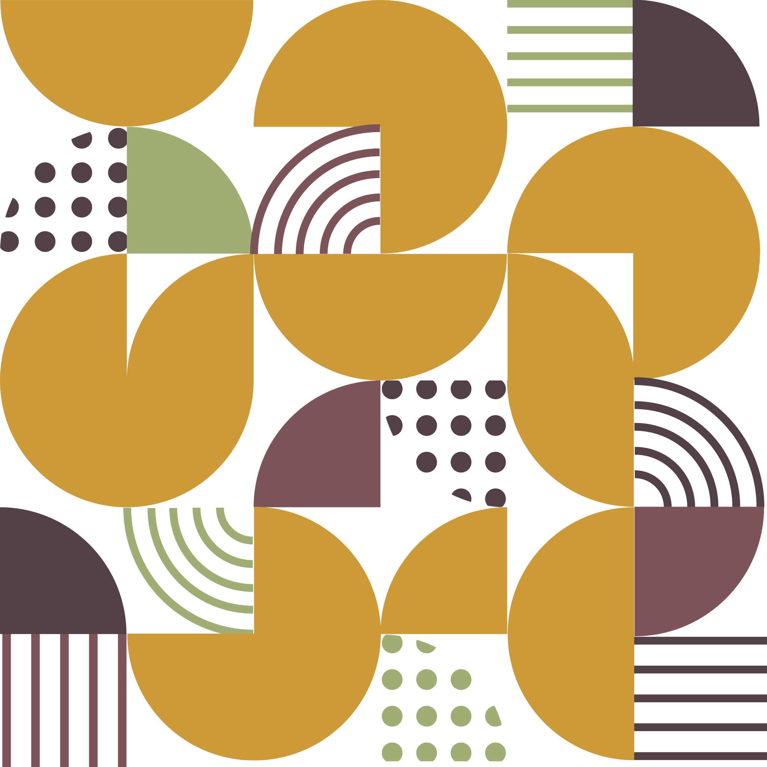
Patterns
A dynamic sense of heat, movement, and rhythm that visually represents High Noon’s playfulness and warmth.